Drawing maps
1.1 rworldmap, World Map and countries
library(rworldmap)


# start with the entire world

newmap <- getMap(resolution = "low")

plot(newmap, main = "World")

# crop to the area desired (outside US)

# (can use maps.google.com, right-click, drop lat/lon markers at corners)

plot(newmap

, xlim = c(-139.3, -58.8) # if you reverse these, the world gets flipped

, ylim = c(13.5, 55.7)

, asp = 1 # different aspect projections

, main = "US from worldmap"

)

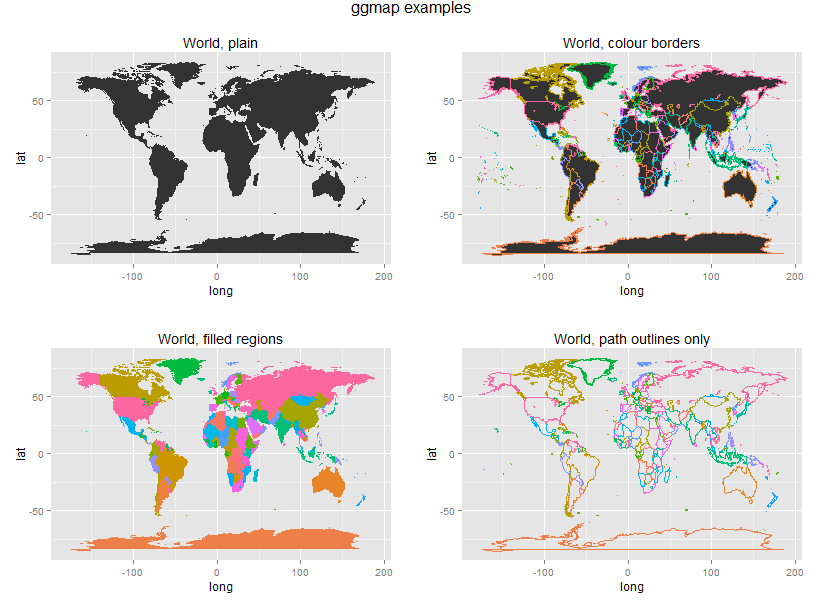
1.2 ggmap, World Map and countries
library(ggplot2)


map.world <- map_data(map = "world")

# map = name of map provided by the maps package.

# These include county, france, italy, nz, state, usa, world, world2.

str(map.world)

# how many regions

length(unique(map.world$region))

# how many group polygons (some regions have multiple parts)

length(unique(map.world$group))

p1 <- ggplot(map.world, aes(x = long, y = lat, group = group))

p1 <- p1 + geom_polygon() # fill areas

p1 <- p1 + labs(title = "World, plain")

#print(p1)

p2 <- ggplot(map.world, aes(x = long, y = lat, group = group, colour = region))

p2 <- p2 + geom_polygon() # fill areas

p2 <- p2 + theme(legend.position="none") # remove legend with fill colours

p2 <- p2 + labs(title = "World, colour borders")

#print(p2)

p3 <- ggplot(map.world, aes(x = long, y = lat, group = group, fill = region))

p3 <- p3 + geom_polygon() # fill areas

p3 <- p3 + theme(legend.position="none") # remove legend with fill colours

p3 <- p3 + labs(title = "World, filled regions")

#print(p3)

p4 <- ggplot(map.world, aes(x = long, y = lat, group = group, colour = region))

p4 <- p4 + geom_path() # country outline, instead

p4 <- p4 + theme(legend.position="none") # remove legend with fill colours

p4 <- p4 + labs(title = "World, path outlines only")

#print(p4)


library(gridExtra)


grid.arrange(p1, p2, p3, p4, ncol=2, main="ggmap examples")
1.3 ggmap, New Mexico and Albuquerque
library(ggmap)
library(mapproj)
map <- get_map(
location = "New Mexico" # google search string
, zoom = 7 # larger is closer
, maptype = "hybrid" # map type
)
p <- ggmap(map)
p <- p + labs(title = "NM hybrid")
print(p)
# some options are cute, but not very informative
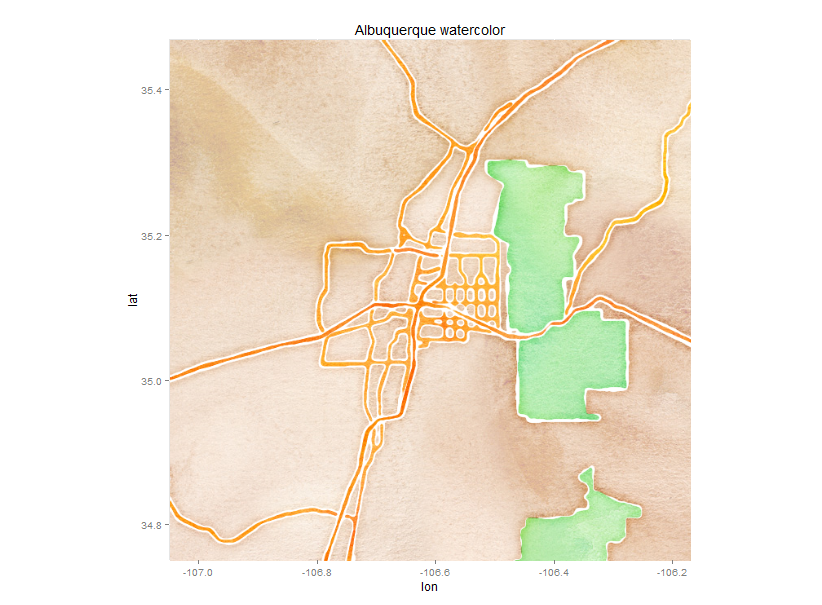
map <- get_map(
location = "Albuquerque, New Mexico" # google search string
, zoom = 10 # larger is closer
, maptype = "watercolor" # map type
)
p <- ggmap(map)
p <- p + labs(title = "Albuquerque watercolor")
print(p)
1.2 Adding data to map underlay
1.2.1 Points
# identify some points around campus

dat <- read.table(text = "

location lat long

MathStat 35.08396 -106.62410

Ducks 35.08507 -106.62238

SC1Class 35.08614 -106.62349

Biology 35.08243 -106.62296

CSEL 35.08317 -106.62414

", header = TRUE)

## Sometimes the watercolor style can look nice.

# get map layer

map <- get_map(

location = "University of New Mexico" # google search string

, zoom = 16 # larger is closer

, maptype = "watercolor" # map type

)

# plot map

p <- ggmap(map)

p <- p + geom_point(data = dat, aes(x = long, y = lat, shape = location, colour = location), size = 7)

p <- p + geom_text(data = dat, aes(x = long, y = lat, label = location), hjust = -0.2)

# legend positioning, removing grid and axis labeling

p <- p + theme( legend.position = "none" # remove legend

, panel.grid.major = element_blank()

, panel.grid.minor = element_blank()

, axis.text = element_blank()

, axis.title = element_blank()

, axis.ticks = element_blank()

)

p <- p + labs(title = "UNM SC1 locations")

print(p)

# Let s say I started in my office in Math & Stat,

# then visited with the Ducks,

# then taught the SC1 class,

# then walked over to Biology,

# then finished by picking up a book in the CSEL library.

## Satellite view with points plotted from get_googlemap()

# the points need to be called "x" and "y" to get the google markers and path

dat.pts <- data.frame(x = dat$long, y = dat$lat)

# get map layer

map <- get_googlemap(

"University of New Mexico" # google search string

, zoom = 16 # larger is closer

, maptype = "satellite" # map type

, markers = dat.pts # markers for map

, path = dat.pts # path, in order of points

, scale = 2

)

# plot map

p <- ggmap(map

, extent = "device" # remove white border around map

, darken = 0.2 # darken map layer to help points stand out

)

p <- p + geom_text(data = dat, aes(x = long, y = lat, label = location), hjust = -0.2, colour = "white", size = 6)

# legend positioning, removing grid and axis labeling

p <- p + theme( legend.position = c(0.05, 0.05) # put the legend inside the plot area

, legend.justification = c(0, 0)

, legend.background = element_rect(colour = F, fill = "white")

, legend.key = element_rect(fill = F, colour = F)

, panel.grid.major = element_blank()

, panel.grid.minor = element_blank()

, axis.text = element_blank()

, axis.title = element_blank()

, axis.ticks = element_blank()

)

p <- p + labs(title = "UNM Walk around campus")

print(p)
1.3 Incidence and density maps
str(crime)

# Extract location of crimes in houston

violent_crimes <- subset(crime, ((offense != "auto theft")

& (offense != "theft")

& (offense != "burglary")))

# rank violent crimes

violent_crimes$offense <- factor(violent_crimes$offense

, levels = c("robbery", "aggravated assault"

, "rape", "murder"))

# restrict to downtown

violent_crimes <- subset(violent_crimes, ((-95.39681 <= lon)

& (lon <= -95.34188)

& (29.73631 <= lat)

& (lat <= 29.784)))

map <- get_map( location = "Houston TX"

, zoom = 14

, maptype = "roadmap"

, color = "bw" # make black & white so color is data

)

p <- ggmap(map)

p <- p + geom_point(data = violent_crimes

, aes(x = lon, y = lat, size = offense, colour = offense))

# legend positioning, removing grid and axis labeling

p <- p + theme( legend.position = c(0.0, 0.7) # put the legend inside the plot area

, legend.justification = c(0, 0)

, legend.background = element_rect(colour = F, fill = "white")

, legend.key = element_rect(fill = F, colour = F)

, panel.grid.major = element_blank()

, panel.grid.minor = element_blank()

, axis.text = element_blank()

, axis.title = element_blank()

, axis.ticks = element_blank()

)

print(p)

# 2D density plot

p <- ggmap(map)

overlay <- stat_density2d(data = violent_crimes

, aes(x = lon, y = lat, fill = ..level.. , alpha = ..level..)

, size = 2, bins = 4, geom = "polygon")

p <- p + overlay

p <- p + scale_fill_gradient("ViolentnnCrimennDensity")

p <- p + scale_alpha(range = c(0.4, 0.75), guide = FALSE)

p <- p + guides(fill = guide_colorbar(barwidth = 1.5, barheight = 10))

#p <- p + inset(grob = ggplotGrob(ggplot() + overlay + theme_inset())

# , xmin = -95.35836, xmax = Inf, ymin = -Inf, ymax = 29.75062)

print(p)

p <- p + facet_wrap( ~ day, nrow = 2)

print(p)
1.4 Minard’s map, modern
library(ggplot2)

library(plyr)


troops <- read.table("http://stat405.had.co.nz/data/minard-troops.txt", header=T)

cities <- read.table("http://stat405.had.co.nz/data/minard-cities.txt", header=T)

russia <- map_data("world", region = "USSR")

p <- ggplot(troops, aes(long, lat))

p <- p + geom_polygon(data = russia, aes(x = long, y = lat, group = group), fill = "white")

p <- p + geom_path(aes(size = survivors, colour = direction, group = group), lineend = "round")

p <- p + geom_text(data = cities, aes(label = city), size = 3)

p <- p + scale_size(range = c(1, 6)

, breaks = c(1, 2, 3) * 10^5

, labels = c(1, 2, 3) * 10^5)

p <- p + scale_colour_manual(values = c("bisque2", "grey10"))

p <- p + xlab(NULL)

p <- p + ylab(NULL)

p <- p + coord_equal(xlim = c(20, 40), ylim = c(50, 60))

print(p)
1.5 Choropleth maps
library(maps)

library(ggplot2)

library(plyr)


# make fake choropleth data

newmexico <- map("county", regions = "new mexico", plot = FALSE, fill = TRUE)

newmexico <- fortify(newmexico)

newmexico <- ddply(newmexico, "subregion", function(df){

mutate(df, fake = rnorm(1))

}

# make standard ggplot map (without geom_map)

p <- ggplot(newmexico, aes(x = long, y = lat, group = group, fill = fake))

p <- p + geom_polygon(colour = "white", size = 0.3)

print(p)

# Now, a fancier map using ggmap...


library(ggmap)

p <- qmap( New Mexico , zoom = 7, maptype = satellite , legend = topleft )

p <- p + geom_polygon(data = newmexico

, aes(x = long, y = lat, group = group, fill = fake)

, color = white , alpha = .75, size = .2)

# Add some city names, by looking up their location

cities <- c("Albuquerque NM", "Las Cruces NM", "Rio Rancho NM", "Santa Fe NM",

"Roswell NM", "Farmington NM", "South Valley NM", "Clovis NM",

"Hobbs NM", "Alamogordo NM", "Carlsbad NM", "Gallup NM", "Los Alamos NM")

cities_locs <- geocode(cities)

cities_locs$city <- cities

p <- p + geom_text(data = cities_locs, aes(label = city)

, color = yellow , size = 3)

print(p)
Reference:
http://statacumen.com/teach/SC1/SC1_16_Maps.pdf
http://spatialanalysis.co.uk/2012/02/great-maps-ggplot2/
http://spatialanalysis.co.uk/2012/01/coming-age-spatial-data-visualisation/
http://geoacrobats.blogspot.de/2011/12/overview-map-with-ggplot2.html
http://www.thisisthegreenroom.com/2009/choropleths-in-r/
http://nrelscience.org/2013/05/30/this-is-how-i-did-it-mapping-in-r-with-ggplot2/
https://uchicagoconsulting.wordpress.com/tag/r-ggplot2-maps-visualization/
http://blog.revolutionanalytics.com/2009/10/geographic-maps-in-r.html
http://www.molecularecologist.com/2012/09/making-maps-with-r/
http://maojf.blogspot.de/2012/01/guides-on-generating-map-plot-with-r.html
Data source
http://www.gadm.org/country
http://www.fas.harvard.edu/~chgis/data/dcw/
http://openstreetmapdata.com/data